Welcome to matplotlib-helpers’s documentation!
Grid plot
The matplotlib_helpers.chart.encode() function is inspired by the
altair project.
With matplotlib_helpers.chart.encode() (quoted from the
altair documentation):
- The data source is a
DataFramethat consists of columns of different data types (quantitative, ordinal, nominal and date/time).- The
DataFrameis in a tidy format where the rows correspond to samples and the columns correspond the observed variables.- The data is mapped to the visual properties (position, color, size, shape, faceting, etc.) using the group-by operation of Pandas.
Usage
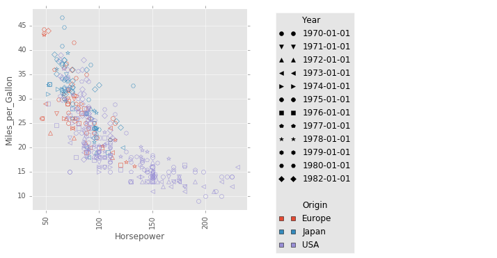
The examples below plot vehicle fuel economy (in miles per gallon) versus horsepower for a dataset from the altair project.
Set marker color by the Year column and set the shape of the each marker
according to the Origin column:
from altair import load_dataset
import matplotlib as mpl
import matplotlib.style
import matplotlib_helpers as mplh
import matplotlib_helpers.chart

# load data as a pandas DataFrame
cars = load_dataset('cars')

with mpl.style.context(['ggplot']):
    mplh.chart.encode(cars,
                      x='Horsepower',
                      y='Miles_per_Gallon',
                      shape='Year',
                      color='Origin',
                      cell_size=5, fill=False)
Split plot into multiple subplots, with the subplot in each column
corresponding to a distinct value in the Origin column.
The same type of handling can be applied using the row keyword.
with mpl.style.context(['ggplot']):
    mplh.chart.encode(cars,
                      x='Horsepower',
                      y='Miles_per_Gallon',
                      color='Year',
                      shape='Year',
                      column='Origin',
                      cell_size=5, fill=False)
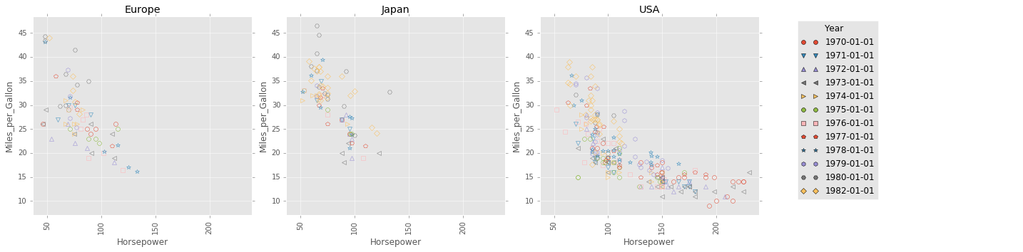
By default, all plots share the same x axis scale and y axis scale. This
behaviour can be changed by setting the sharexscale keyword argument or the
shareyscale keyword argument.
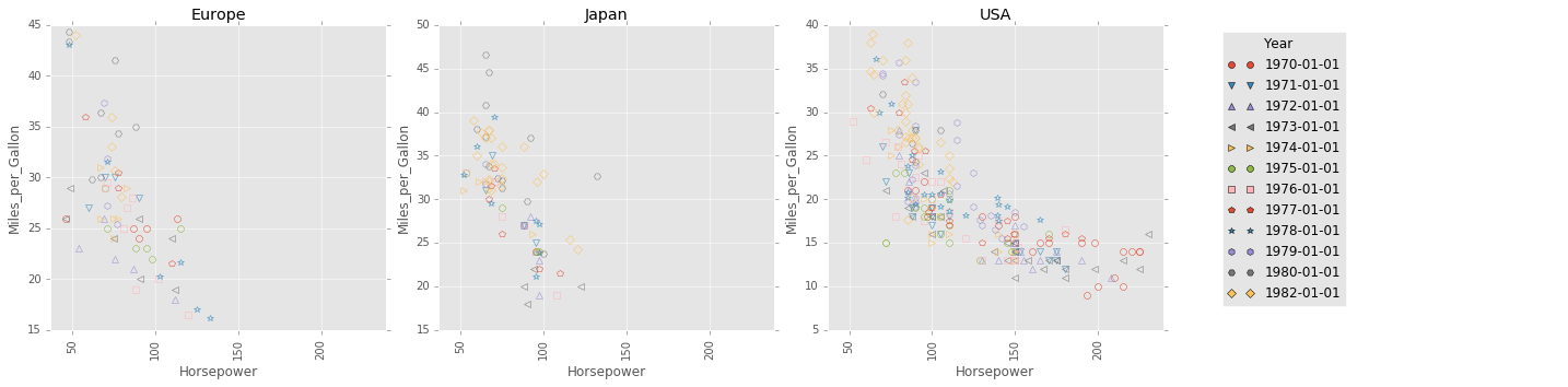
For example, note that the subplots below all have different x axis and y
axis scales.
with mpl.style.context(['ggplot']):
    mplh.chart.encode(cars,
                      x='Horsepower',
                      y='Miles_per_Gallon',
                      color='Year',
                      shape='Year',
                      column='Origin',
                      sharexscale=False,
                      shareyscale=False,
                      cell_size=5, fill=False)
See the matplotlib_helpers.chart.encode() documentation for more details.
Contents: